


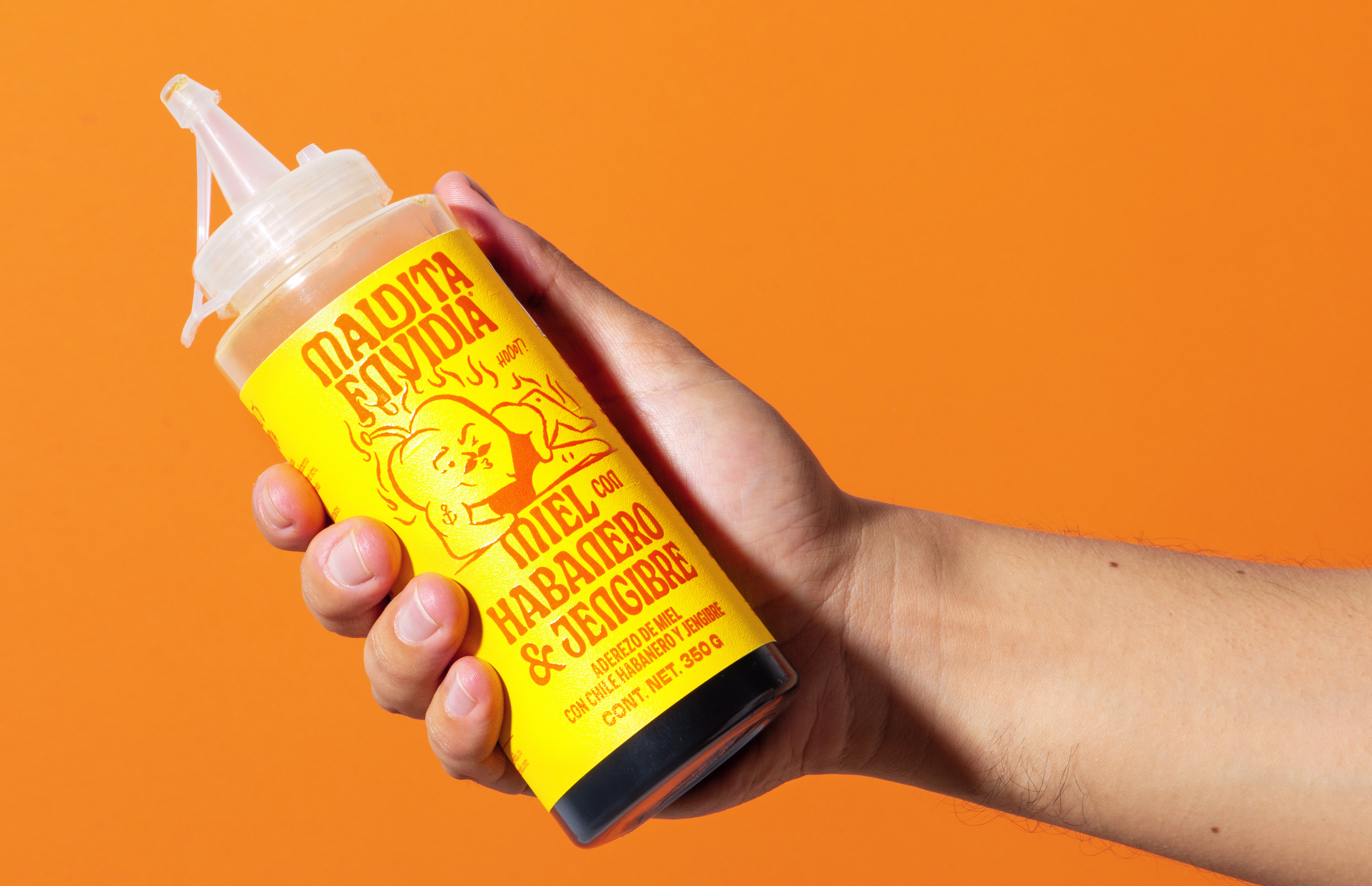


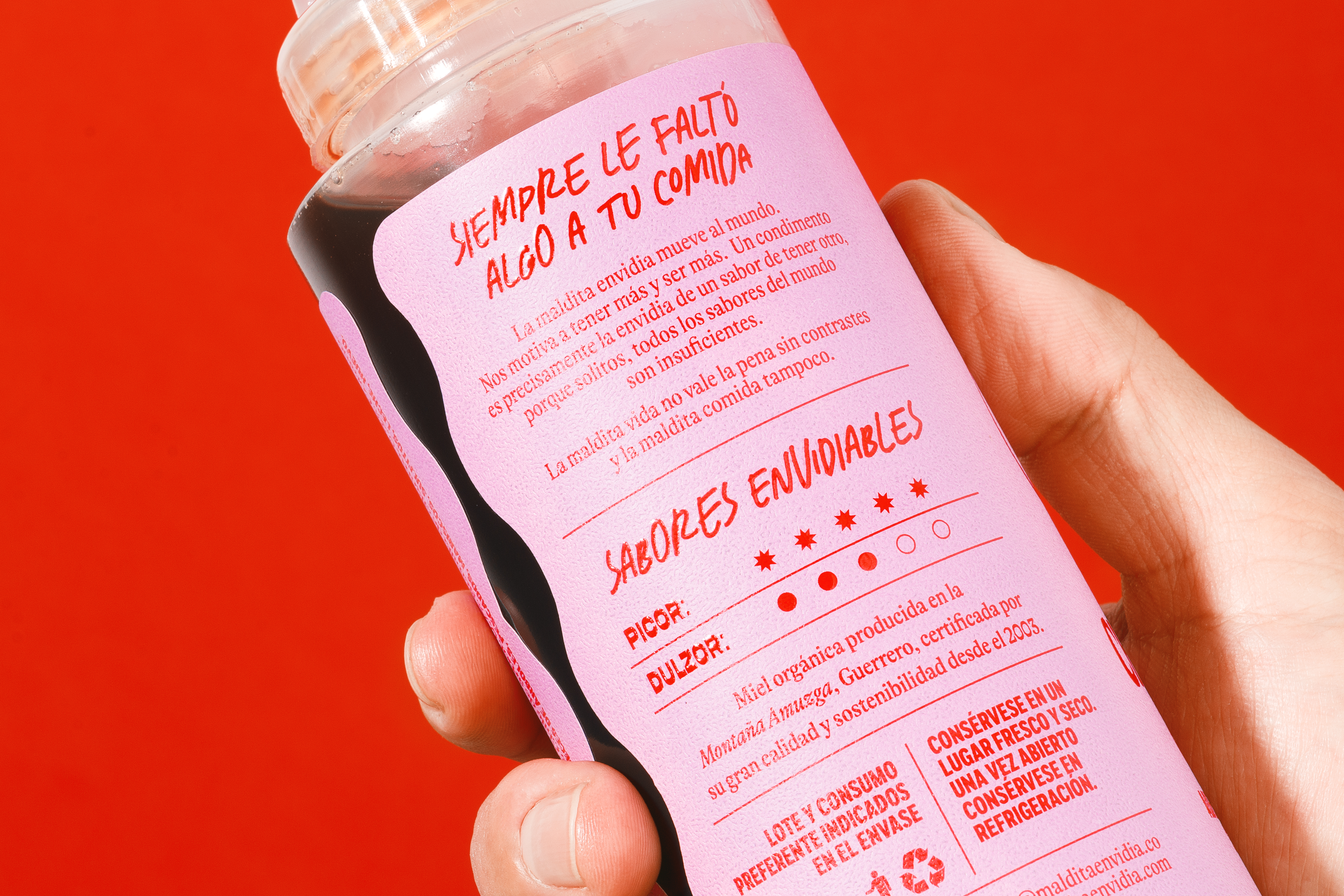


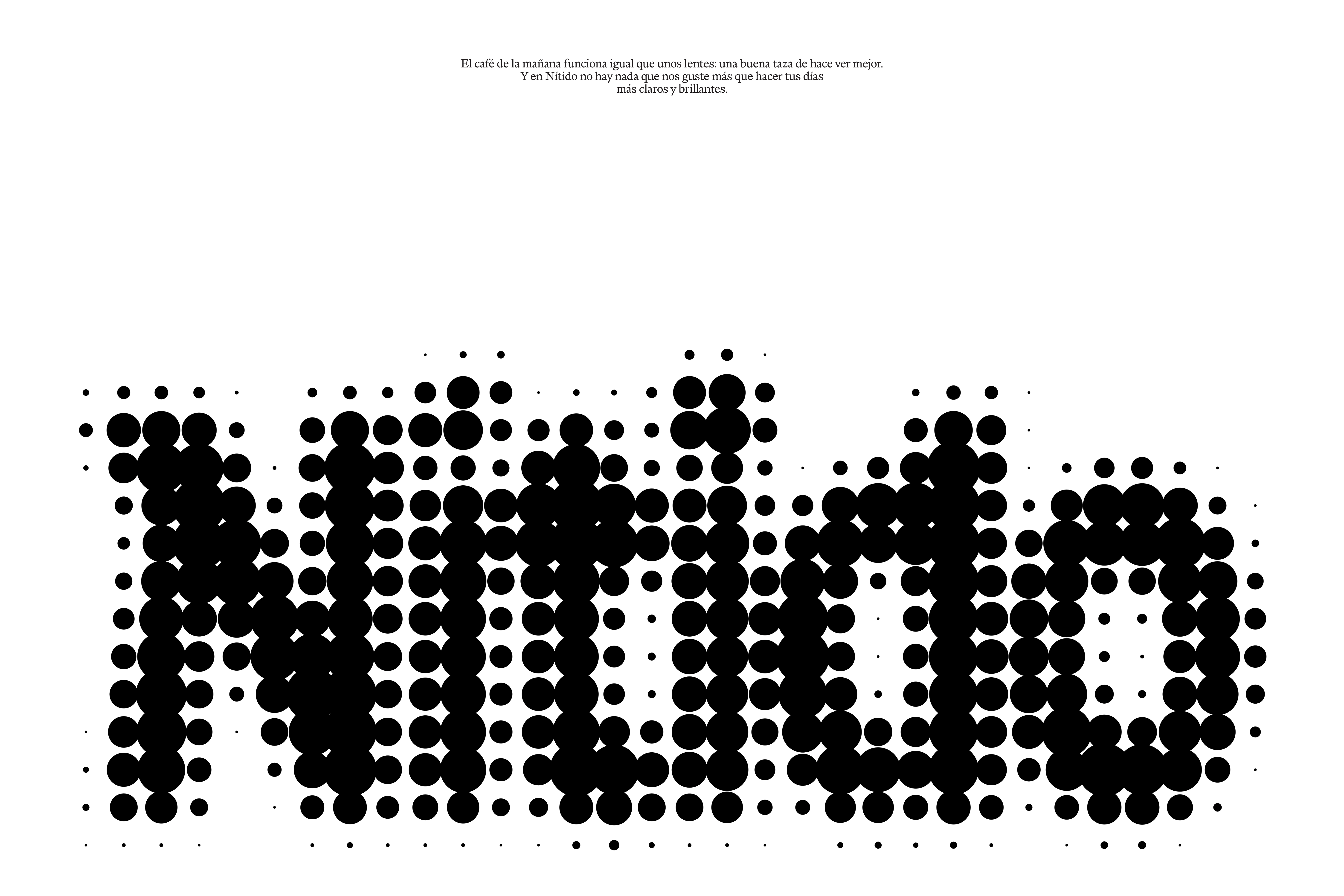
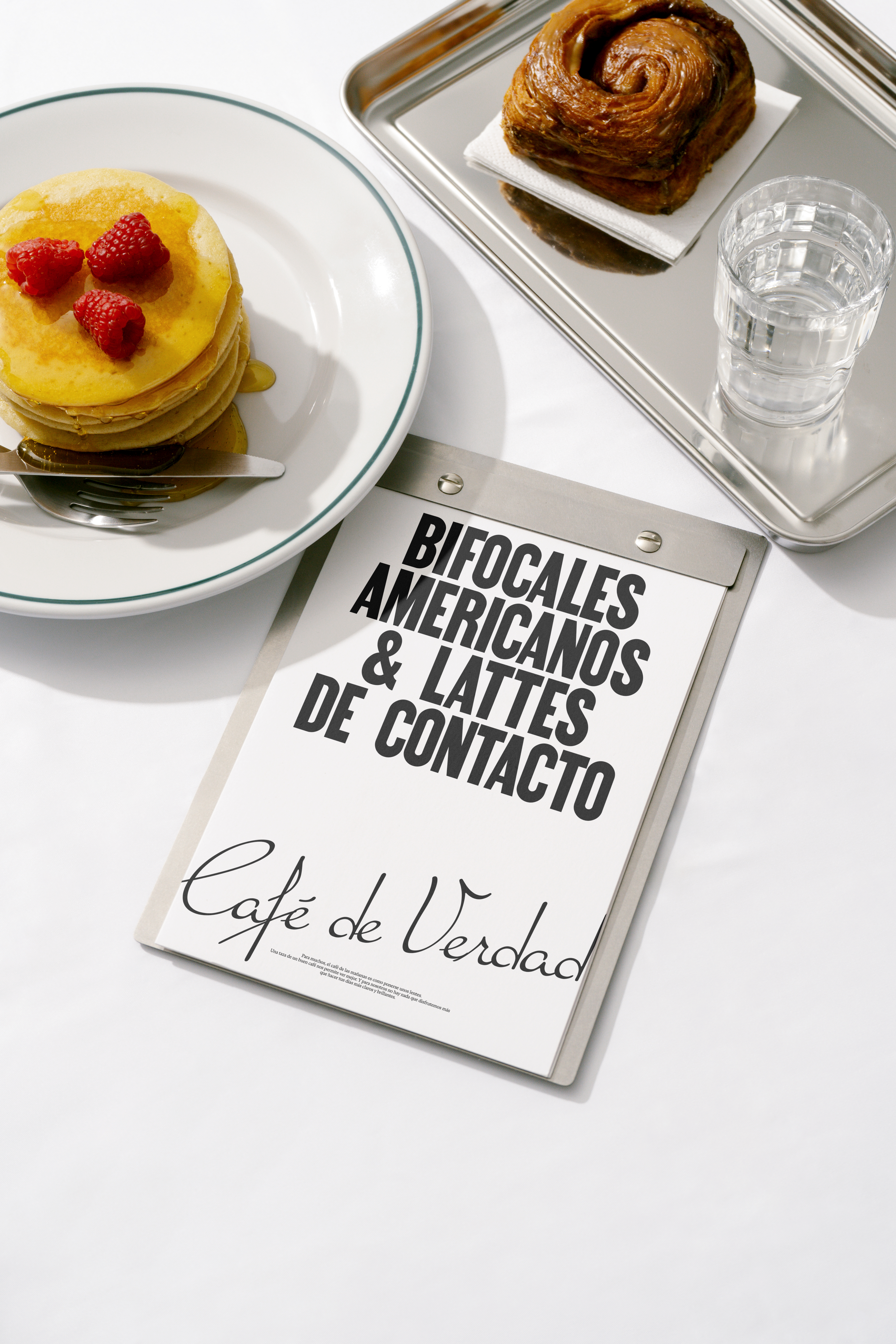
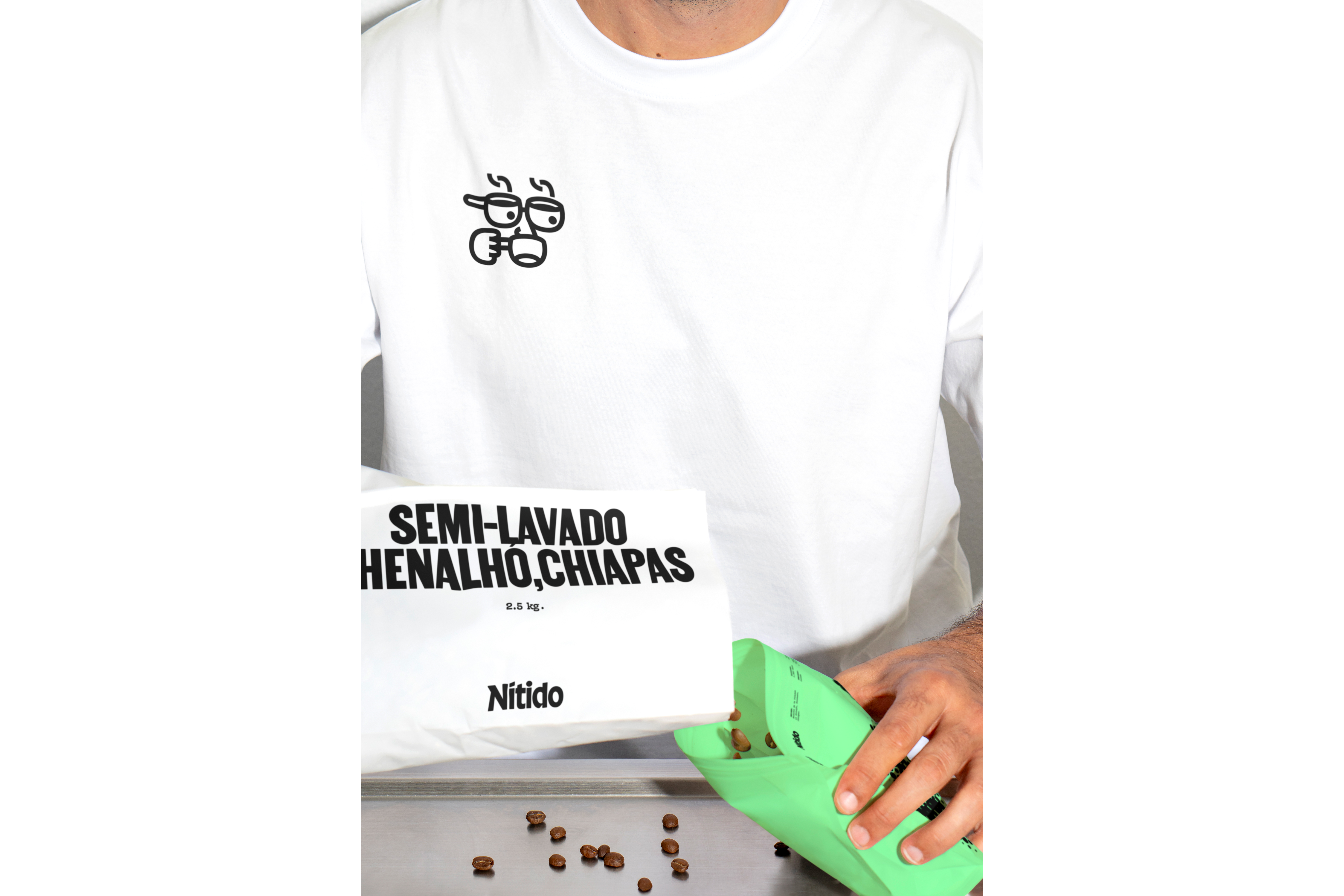
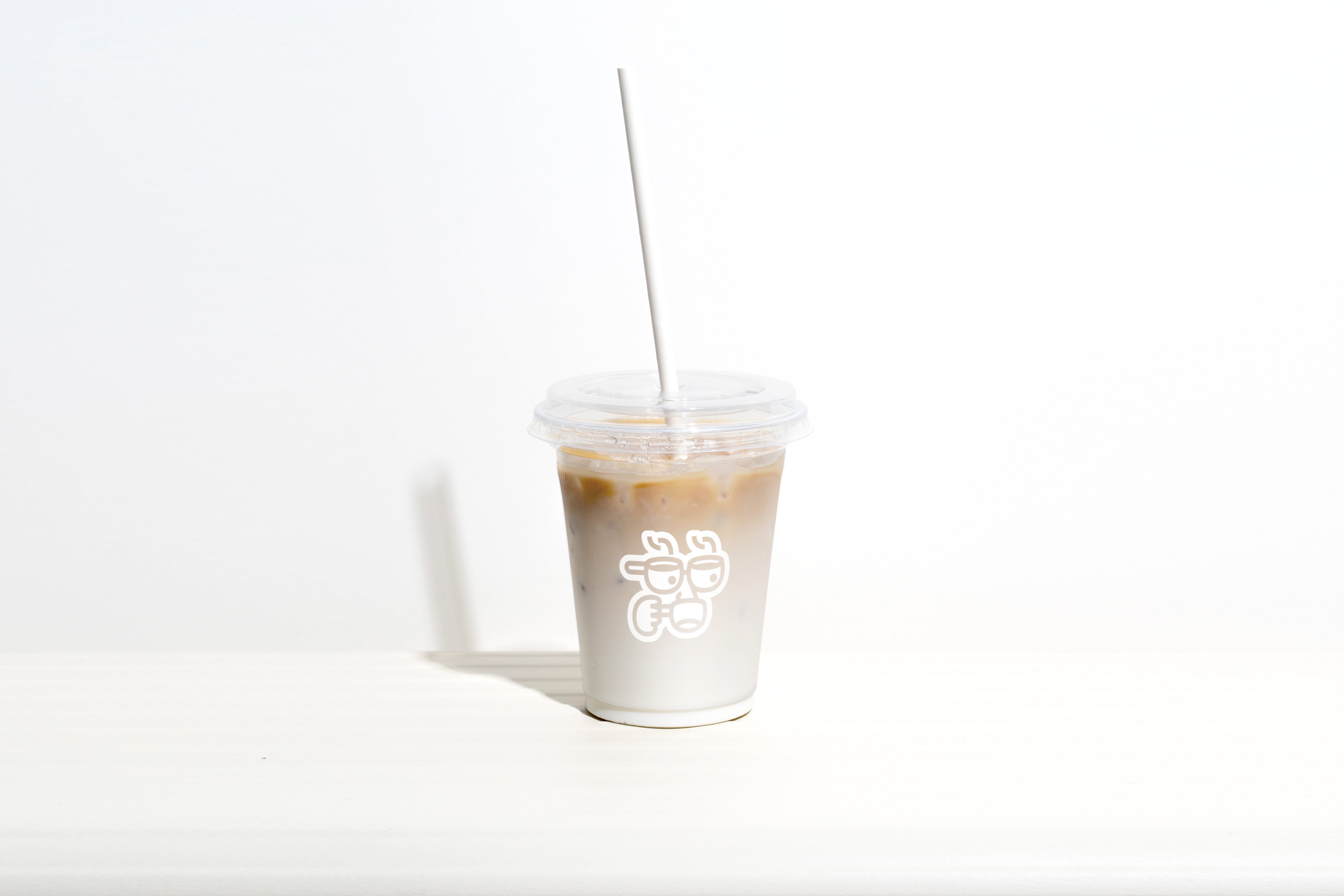
El café de la mañana funciona igual que unos lentes: una buena taza te
hace ver mejor. Por eso, el wordmark de la marca está borroso, pero no te
preocupes, se volverá Nítido en cuanto tomes tu primer sorbo. El personaje que
representa a esta cafetería es un tipo que lo entiende: sus ojos son tazas que
usa como gafas para ver el mundo más claro y brillante.
Morning
coffee works just like a pair of glasses: a good cup helps you see better.
That’s why the brand’s wordmark is blurry—but don’t worry, it will become sharp
as soon as you take your first sip. The character representing this coffee shop
gets it: his eyes are cups he uses as glasses to see the world more clearly and
brightly.


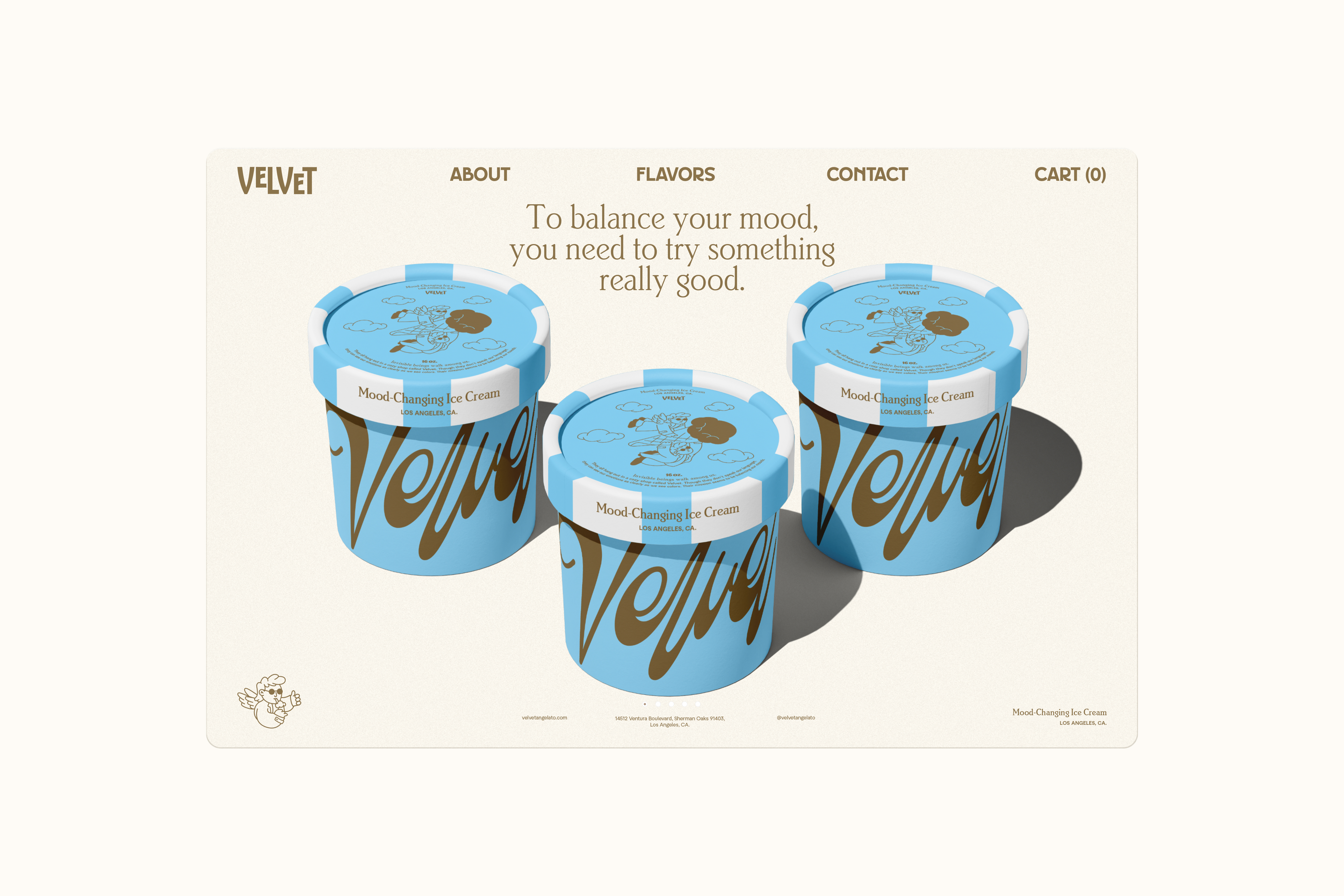
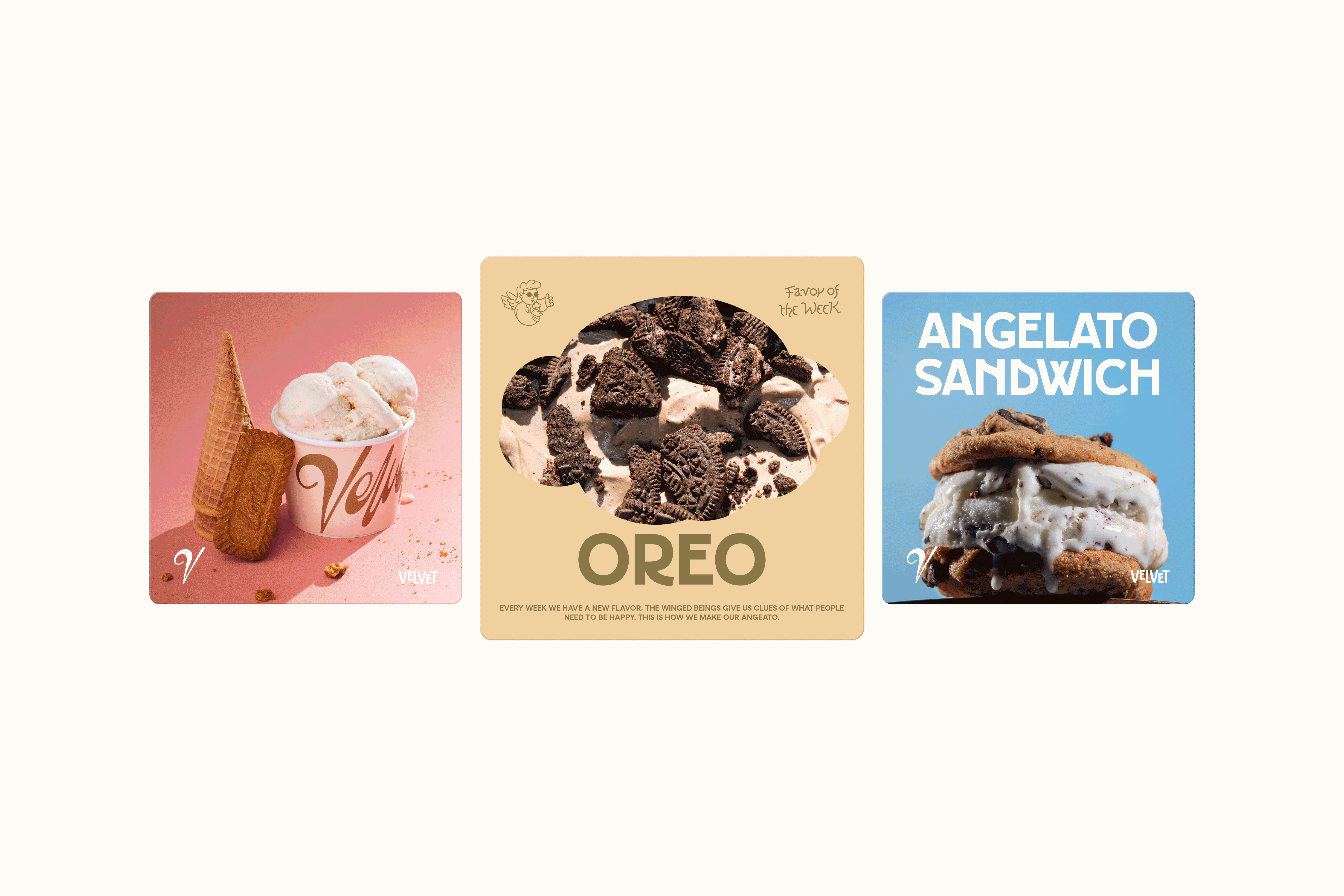
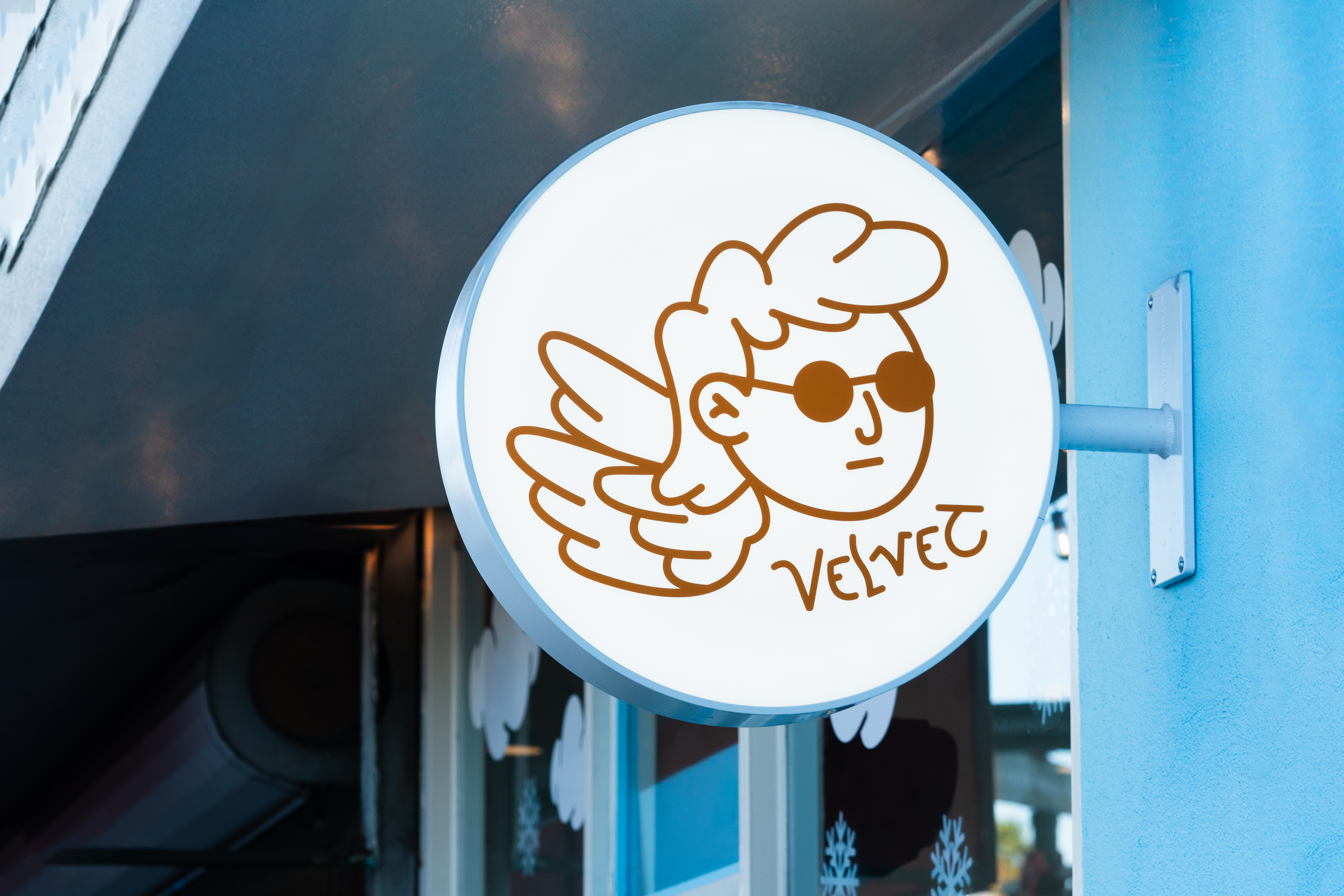
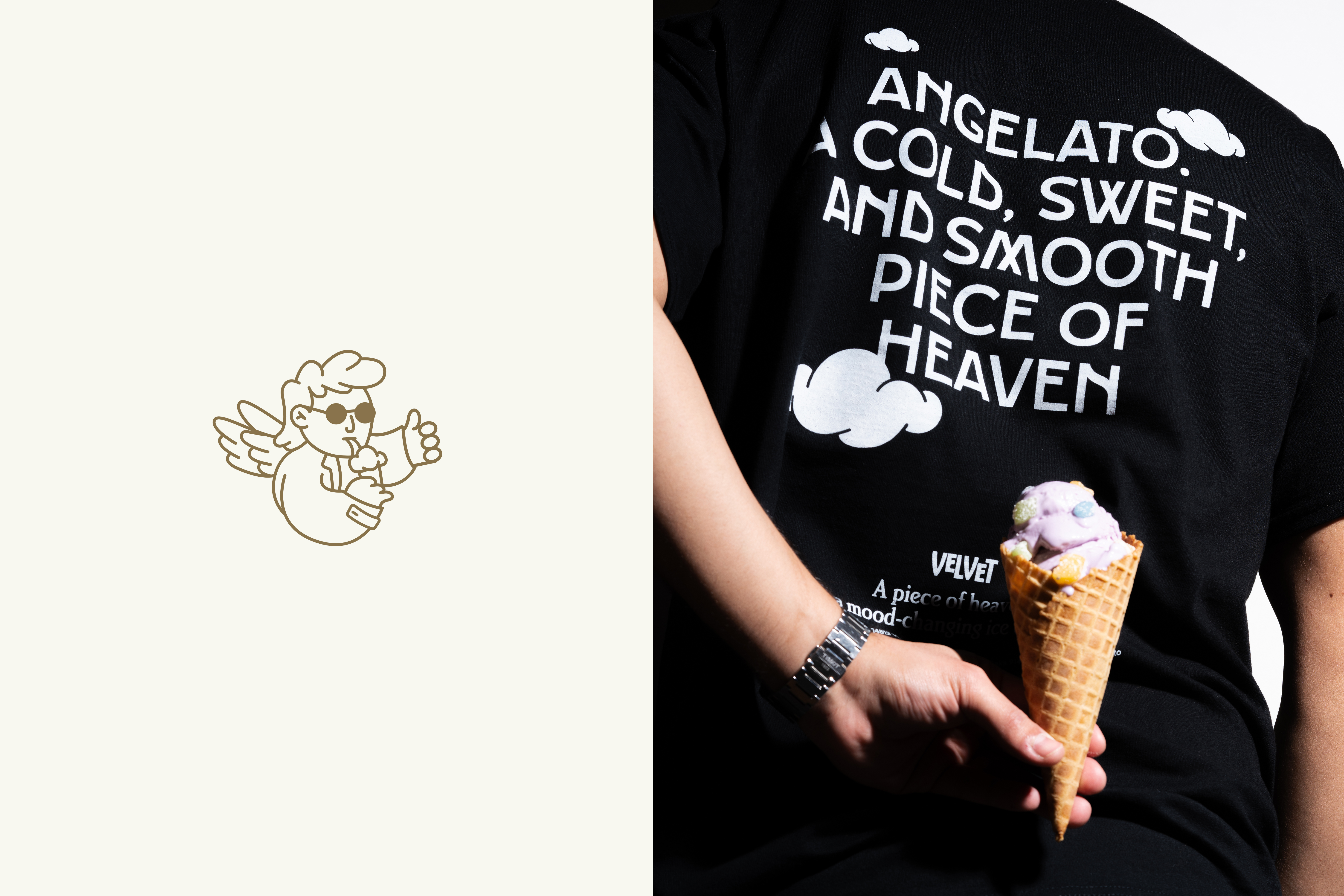
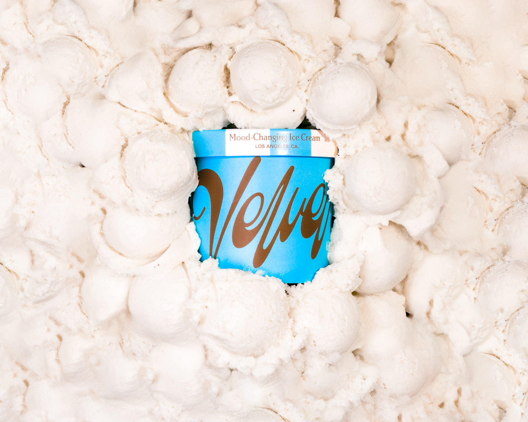
Los Angeles has become the city of stories, and ice cream is a treat that seems to come from fantasy worlds. Its flavor has the power to change our mood in an instant, much like movies do. With those elements to play with, we decided to pay tribute to both cinema and the city. To develop the brand’s story, we drew inspiration from the movie Wings of Desire and its fictional universe: a gray world where invisible angels walk among humans, helping them feel better during difficult times.
Los
Ángeles se ha convertido en la ciudad de las historias y el helado es un
alimento que parece provenir de mundos de fantasía, su sabor es capaz de
cambiar nuestro estado de ánimo en un segundo, como las películas. Con esos
ingredientes para jugar, decidimos hacer un homenaje al cine y otro a la ciudad.
Para desarrollar la historia de la marca hicimos un homenaje a la película
Wings of Desire y su universo de ficción: un lugar gris donde ángeles
invisibles caminan entre los humanos y les ayudan a sentirse bien cuando pasan
por malos momentos.
︎Los Angeles CA.
Branding: Estudio Cariño
Copy: Iván Soto Camba
Product Photography: Axel Troncoso
Branding: Estudio Cariño
Copy: Iván Soto Camba
Product Photography: Axel Troncoso


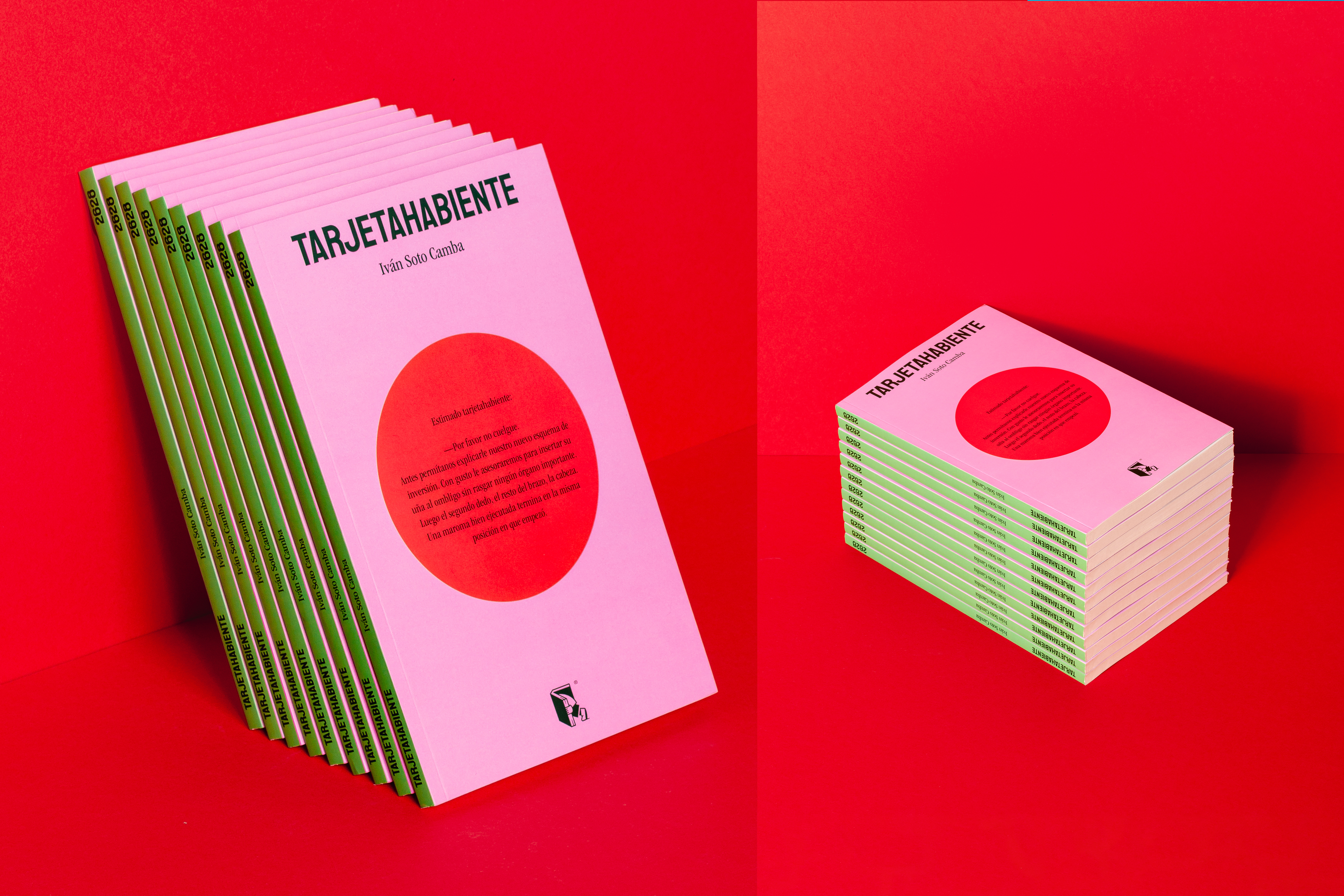
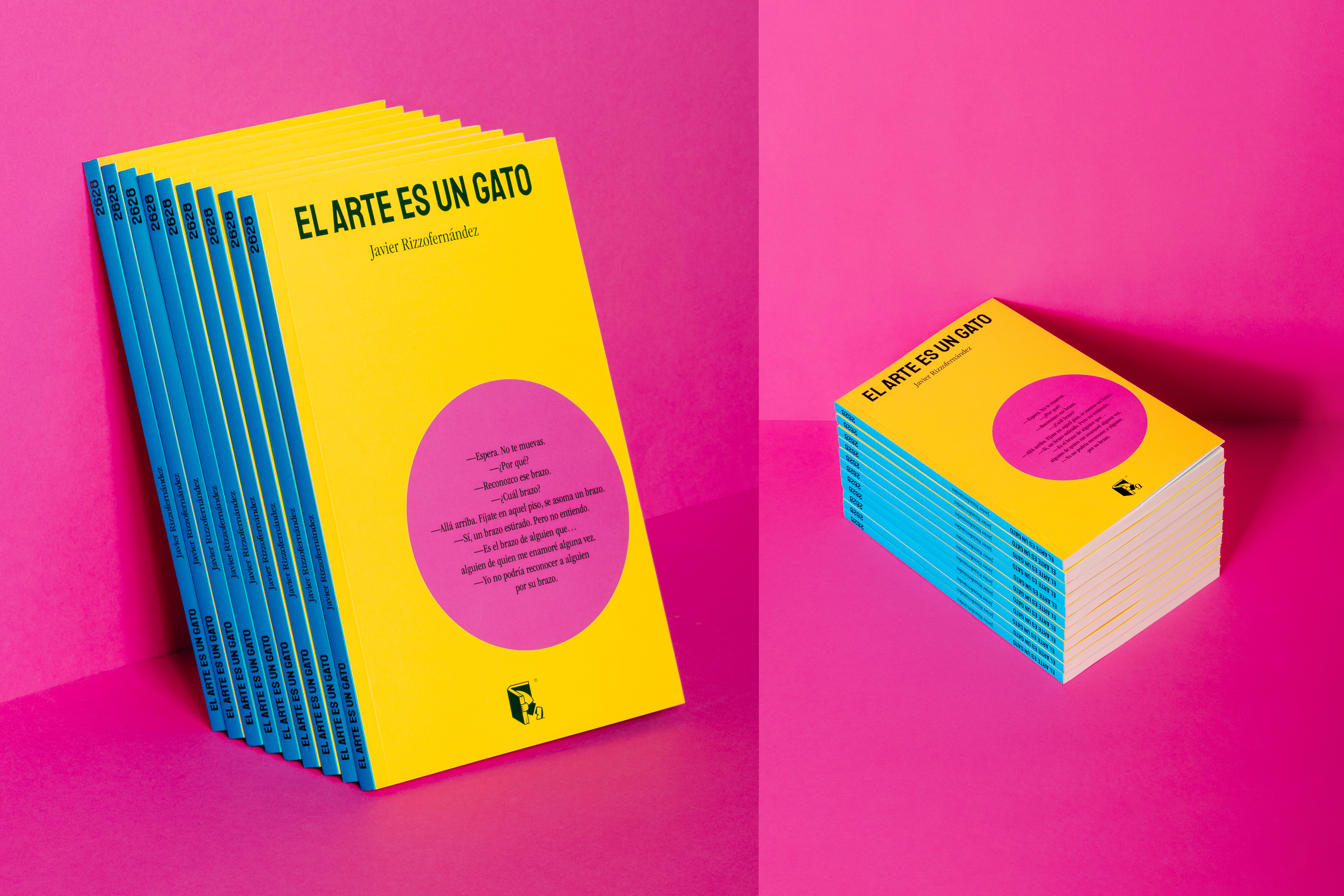
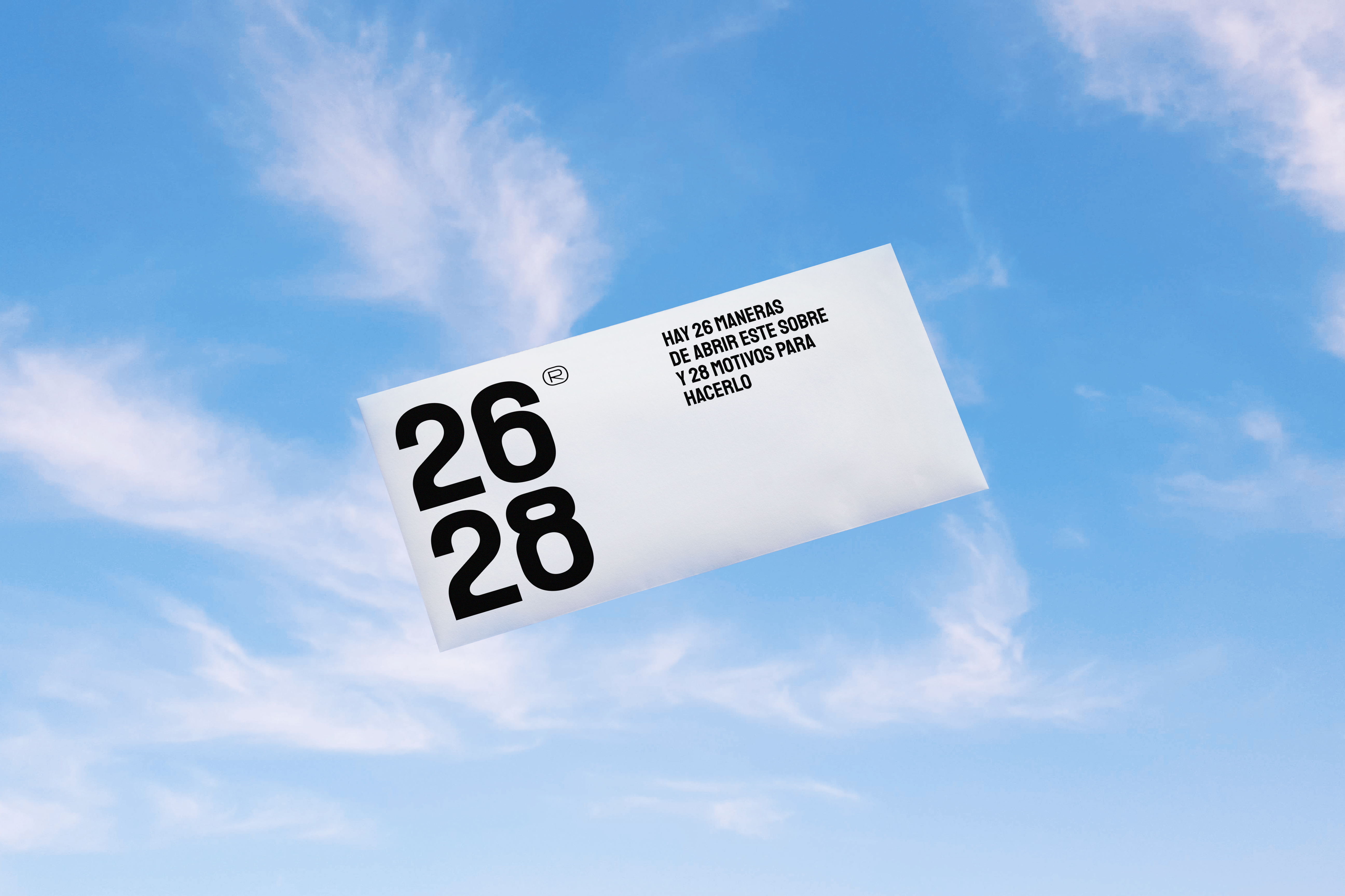
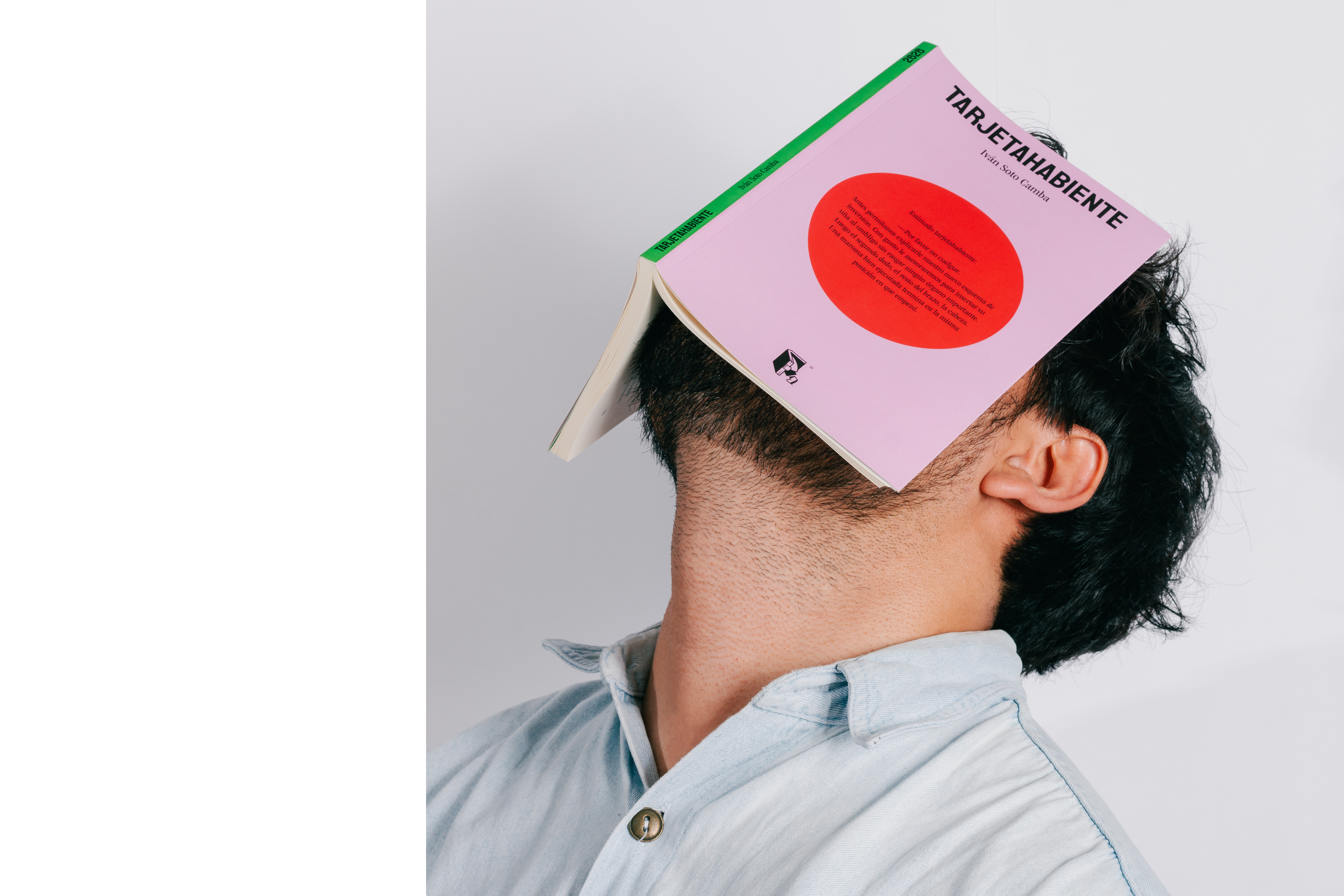
Para el
año 2628 ya no habrá libros, estaremos todos muertos. Estadísticamente la
página 26 es la mejor de cada libro y la 28 la peor. Todos los miembros del
club de los 27 tenían más de 26 años al morir, pero menos de 28. Ah, y todos
los libros de esta editorial se trabajaron en un edificio que lleva por número
2628. Esos números son claramente importantes para los creadores de este
proyecto, que nos confiaron la misión de crear su identidad gráfica y diseñar
su primera colección de portadas.
For the year 2628, there will be no more books; we
will all be dead. Statistically, page 26 is the best in every book, and page 28
is the worst. All members of the 27 club were over 26 years old when they died,
but less than 28. Oh, and all the books of this publishing house were worked on
in a building with number 2628. Those numbers are clearly important to this
project's creators, who entrusted us with the mission of creating their graphic
identity and designing their first collection of covers.
📍️ Guadalajara, México
Brading & Design: Estudio Cariño /
Copywriting: ︎︎︎ Iván Soto Camba Photography: ︎︎︎ Presente Continuo Perfecto
Brading & Design: Estudio Cariño /
Copywriting: ︎︎︎ Iván Soto Camba Photography: ︎︎︎ Presente Continuo Perfecto


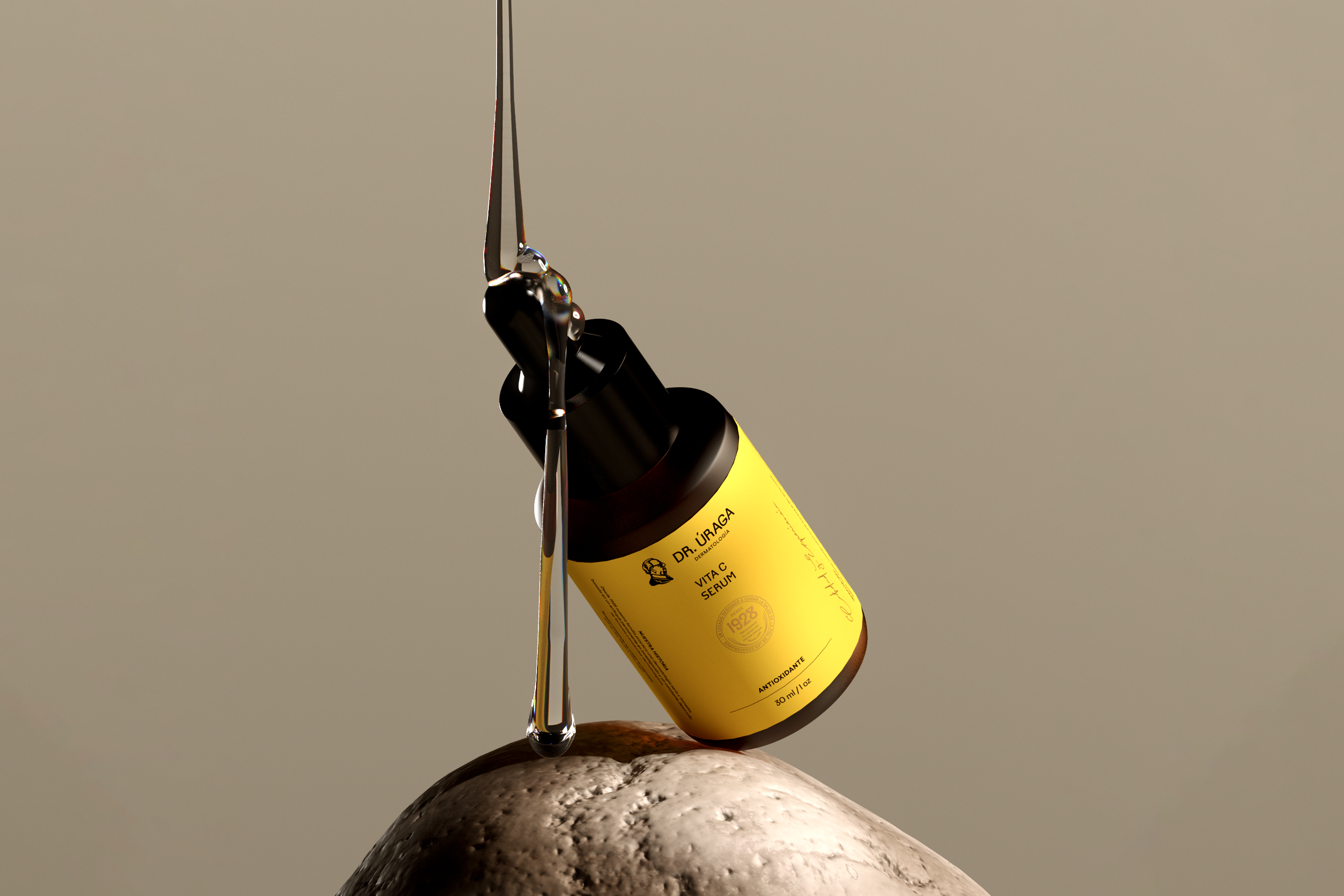
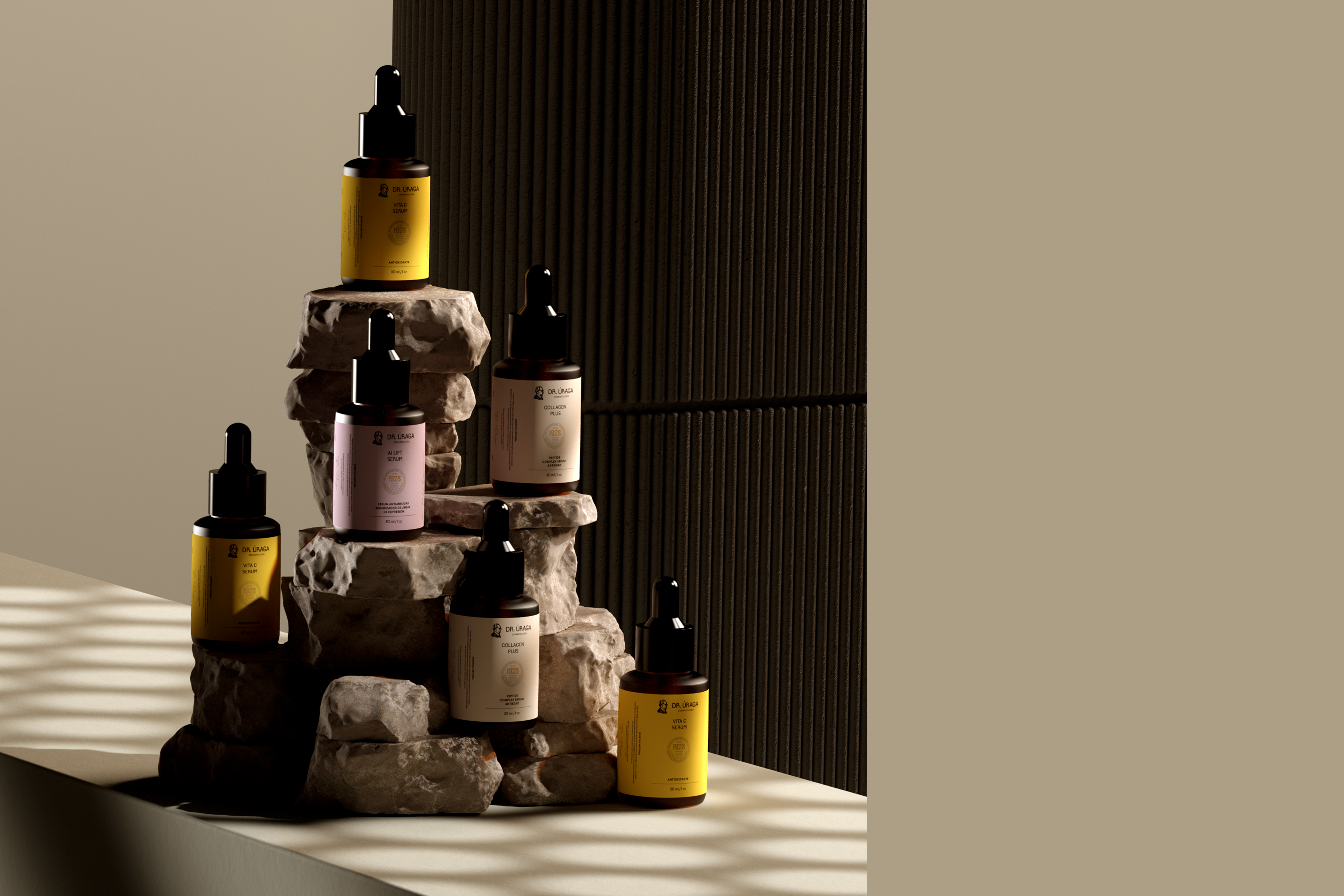
The Doctor Úraga redesign project involves a skincare brand and clinics in Guayaquil, Ecuador, established in 1928 and now managed by the third generation. With a significant reputation and long-standing tradition, the goal was to update it for emotional resonance with the new generation while preserving its history.
The chosen approach was simplicity, focusing on creating a new profile of Dr. Úraga, the brand’s founder. His distinctive features were highlighted for Ecuatorian consumers, integrated into a modern, clean graphic enviroment with inconventional colors. Emphasizing authenticity and innovation, the design captured the essence of Dr. Úraga’s vision.
Acknowledge as crucial and challenging, the rebranding work aimed to connect with new generations withput alienating existing customers. The strategy found a precise balance between tradition and innovation, considering the cultural context to preserve the brand’s heritage while meeting contemporary expectations.
📍️ Guayaquil, Ecuador
Brading & Design: Estudio Cariño / ︎︎︎ Estudio Romero
CGI - 3D Modeling: ︎︎︎ Contramateria
📍️ Guayaquil, Ecuador
Brading & Design: Estudio Cariño / ︎︎︎ Estudio Romero
CGI - 3D Modeling: ︎︎︎ Contramateria